What Is Order Flow?
Most traders make decisions based on price alone — candlestick patterns, moving average crossovers, or indicator signals. Order flow trading goes one level deeper. Instead of looking at where price has been, order flow shows you the actual buying and selling activity that is causing price to move.
Every tick in the futures market is either a buy or a sell executed at a specific price. Order flow tools capture this raw transaction data and present it in ways that reveal the intentions of the traders — particularly large institutional players — behind the move. The footprint chart is the most powerful place to start.
What Is the Footprint Chart?
The easy explanation is: a footprint chart is an order flow tool that shows you what's happening inside each candle. Specifically the buying, selling, and imbalance at every price level within each candle. The benefit is that it helps you highlight where the overpowering buying or selling is happening in an area.
The standard candlestick chart shows you the OHLC. The footprint shows you who was in control and where the aggression happened.
At Paralia Trading Desk, we use a reversal bar footprint in Sierra Chart for Nasdaq and S&P 500 futures. The reversal bar is 24-0 for Nasdaq (NQ) and 16-0 for the S&P 500 (ES).
Components of the Footprint Chart
The Basic Structure
Each "cell" in the footprint candle shows traders one price level and displays two numbers: Bid volume × Ask volume.
- The left number is market sell orders hitting the bid
- The right number is market buy orders lifting the ask
There are some numbers highlighted red (left) and green (right) which represent imbalanced traders compared to the diagonal opposing side. These are aggressive traders showing strength in the direction of the move.
Stacked Imbalances
Stacked imbalances are multiple consecutive imbalances on the same side across price levels. This is a high-conviction signal of one-sided aggression — a genuine institutional footprint. This gets highlighted along with "zero" prints that extend in either blue or red to show the aggression of the move.
Zero Prints
A zero print is a price level inside a candle where no trades executed on one or both sides — meaning price moved through too fast for the auction to do real business there. These levels act as magnets, because the market tends to return and "fill in" unfinished business. Stacked zero prints signal genuine one-sided aggression; isolated ones near candle extremes can flag exhaustion.
Delta
Delta is the difference between ask volume and bid volume at a given level or for the whole candle. Positive delta = net buying pressure, negative = net selling. These are found attached to the right of each candle. The larger delta levels are points of interest because they show imbalance transacted at that area — where large players are swaying prices in one direction or another.
Large Trade Bubbles
Large Trade Bubbles highlight major areas where large sellers or buyers came into the market at once, above a certain threshold. This imbalance helps traders understand if there is absorption or heavy continuation in a direction.
Point of Control (POC)
The Point of Control (POC) is the price level with the highest total volume within the candle. It often acts as a short-term magnet and is highlighted in yellow in each candle.
"The footprint doesn't give you more signals — it gives you better context on the signals that actually matter."
How to Read the Footprint Chart
The footprint chart is a powerful tool that allows traders to understand where large imbalances are happening in the market within each candle. They provide two main clues:
- Where buying or selling is strong for continuations
- Where there is heavy absorption for reversals
When reading the footprint it's important to not get swayed by all of the numbers and all of the imbalances or delta that appear. There are many numbers flying around on the screen and not all outliers are going to be important enough to trade from.
With order flow, a rule of thumb is how the large outlier reacts. If there is speed and reaction from the imbalance (delta, within the candle, or bubble) then there is merit in that imbalance — as well as how well it holds when prices come back to the region.
Constant rejection of an outlier proves its worth.
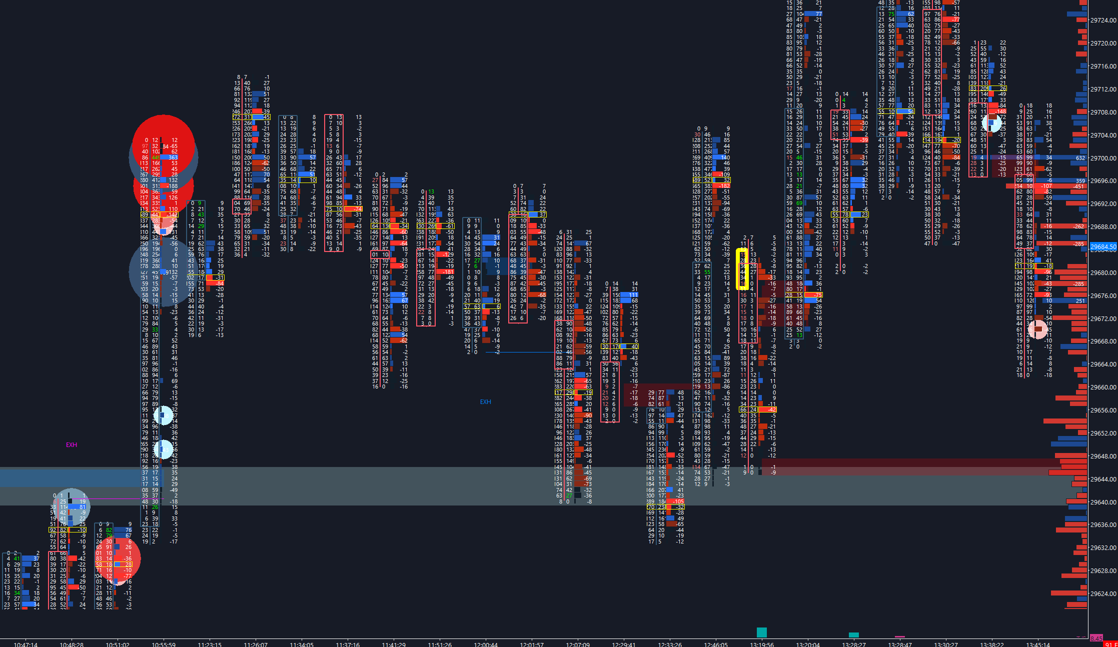
For instance, in the image below we're overwhelmed with a lot of information and a lot of imbalanced movement. (Using the Nasdaq futures chart)
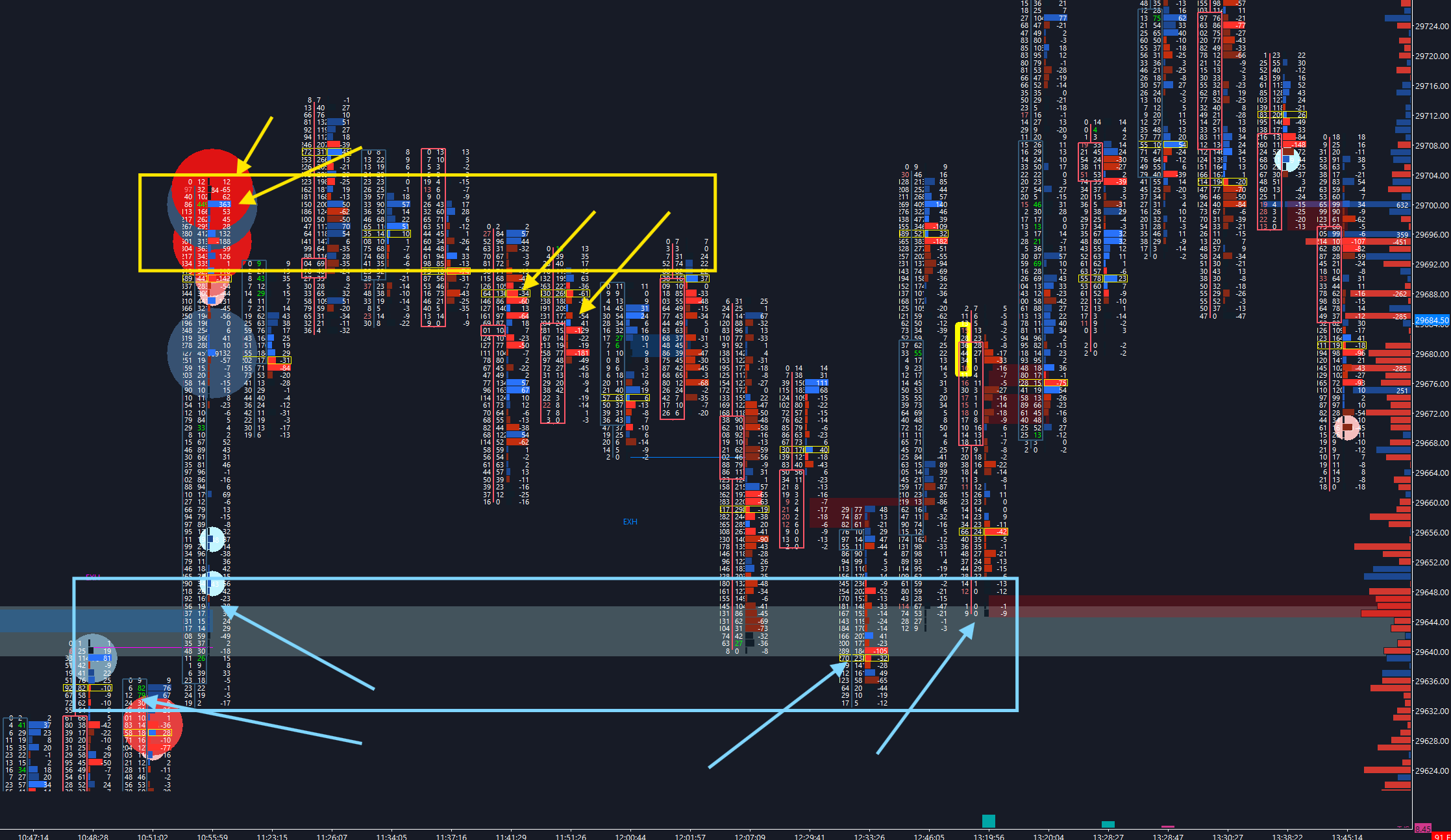
There are two potential moves and trades.
The first in the yellow box: At the top of the expansion, we can see very heavy bubbles hitting the market, along with a large blue delta and a large buy imbalance into the high. As price rejects this area (goes down aggressively) and continues to reject on each rotation back into the level (yellow block) we can take a short position to target the other side of the imbalance (where we have large buying).
The second in the blue box: The expansion above the prior absorption around 29,640 on the Nasdaq chart starts with really heavy buy bubbles. This area mixed with the prior bubbles left behind turns into a large area of support. When price comes back into the area, we want to see if there are rejections and potentially larger imbalanced traders that come in. In this case it holds really well — an area we can get behind. This is the long to target the prior yellow box of heavier selling and possibly higher. Considering we're directionally bullish.
Combining the Footprint With the EDGE Trading System
In the EDGE Trading System, we use the footprint and order flow in the Gauge portion — where we want to confirm the validity of the level and trade.
If all things align in Evaluate & Define we wait for prices to come into the key area we want to trade and watch if there is heavy imbalancing on the footprint:
- Imbalances
- Delta
- Large Bubbles
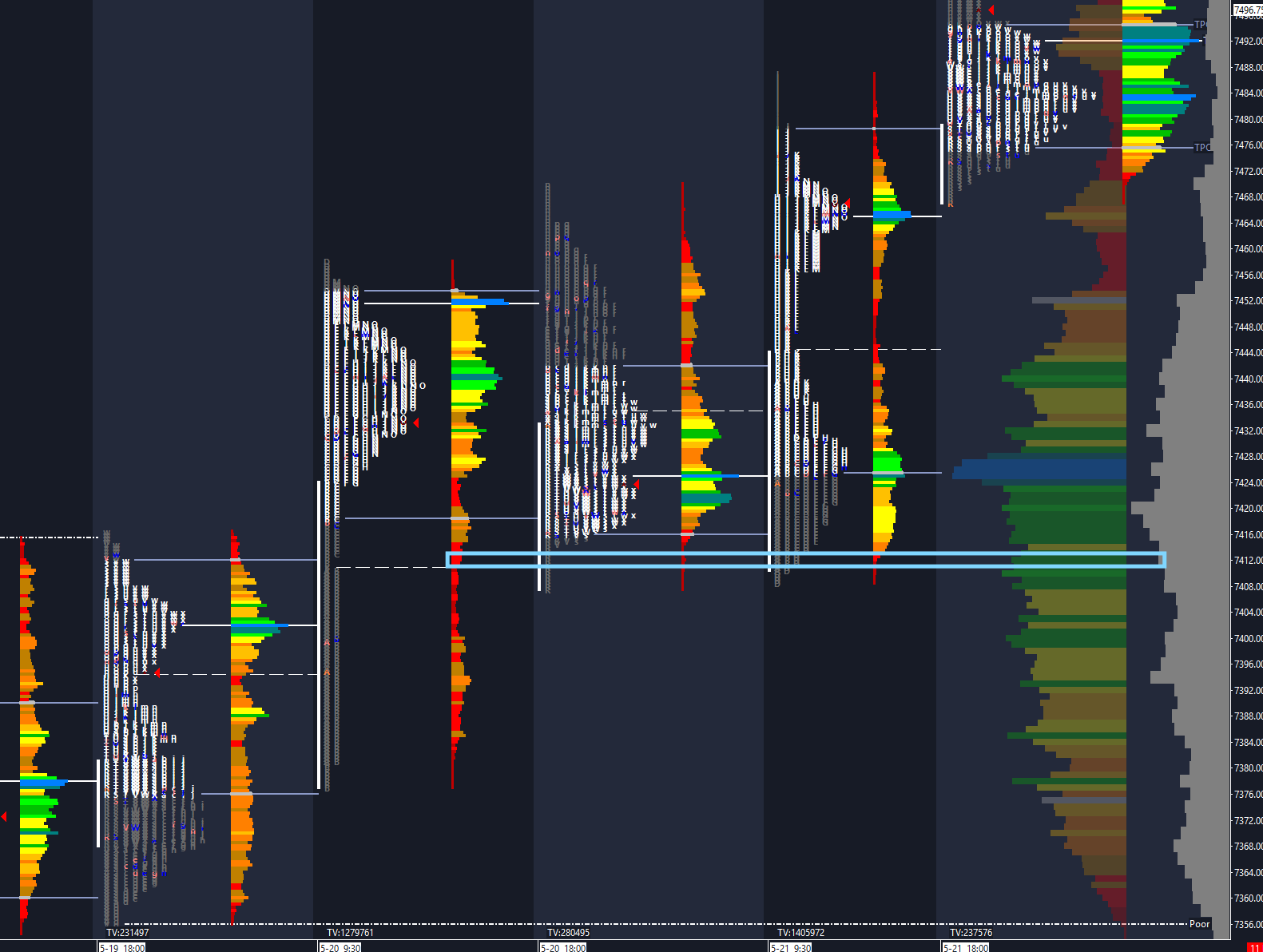
Looking at an example on the S&P 500 Futures, the first steps Evaluate & Define show us that there is an area around 7410 on the market that we should hold out to continue the buy side momentum higher. As seen in the volume profile below.
Then we move over to the footprint below. We can see in the blue box that there is a heavy delta at the same area as a large buy imbalance. The swift move higher tells us that this point is of heavy support.
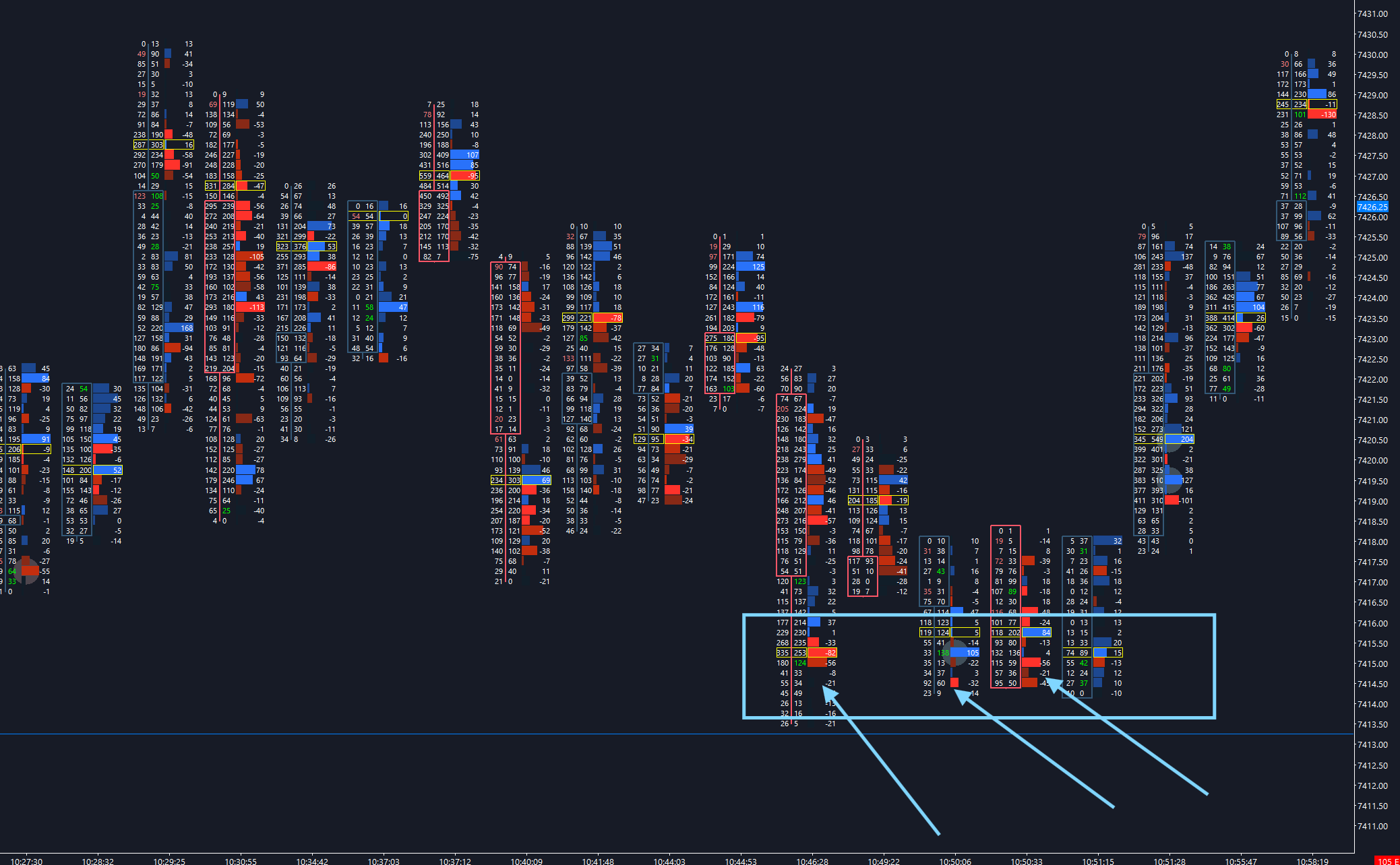
The rotation and push back into those initial imbalances creates more buy delta, another buy imbalance, and a heavy buy bubble that rotates price higher. This is the trigger for the trade — we're looking for the top of the prior rejection around 7428.
Patience pays in these markets. We want to see specific things line up in both the auction and the order flow before pulling the trigger.
Getting Started With the Footprint
If you're new to order flow, start by watching the footprint at specific areas that you've already marked on the volume profile as key points of interest to trade. Look at the footprint on a liquid market like the S&P 500 (ES) or Nasdaq (NQ).
Don't trade off the footprint alone at first. Instead, simply observe: does the footprint confirm or fail at key price levels? Over time, you'll develop the pattern recognition that makes order flow trading more intuitive.
The full Order Flow curriculum — including footprint charts, absorption, and live application — is covered inside Paralia Trading Desk's course library and daily live streams. See also the Auction Market Theory guide and the EDGE Trading System breakdown to understand how footprint charts fit into a complete trading framework.